Friday, 7 December 2012

Report: "Re-Civilize Yourself"

Nivea’s “Recivilise Yourself” Campaign (2012) Unknown. Available at: < http://blog.ebuzzing.co.uk/article-social-media-buzz-22-08-11-86282662.html> [Accessed 28th October 2012]
Introduction
We chose to revamp a racist Nivea ad. This advertisement showed a Caucasian male throwing the head of an African American with the tag line, ''Re-Civilize Yourself"". We get what they're trying to say but the way they chose to portray the advertisement itself was considered to be racist. At the same time, they are not just discriminating the race, they are also directing it towards the culture of the African Americans as well.

Purpose
The main purpose of the advertisement is to show the revitalizing qualities of their new line of Nivea products. They want to show the modernization of man where the dishevelled and unkempt look have become outdated and should be replaced with a more civilized  appearance. 

It's Relation To Culture and The Society It Was Made For
This product was initially directed / made for Americans; but in fact, this promotional poster can somehow be related to the Malaysian culture as well. The Malaysian society consists of various cultures and religions. Being a multicultural country, we do constantly have our misunderstandings amongst each other. The relations to both Americans and Malaysians is unlimited because the products aren't just directed to one country, it is universal. Nivea is an international company which sells their products across the globe, so it is not just limited to their country, they have to promote their products to other countries.

Why Do We See The Need For A Change
The promotional poster itself is misleading and it should get its main point across. The designers as well as the superiors who created and approved the poster should have given more thought and consideration of its suitability and how it would affect the society. The poster shouldn't make people angry or hurt, it should make them understand more about the product instead. 

How Different and Effective Our Idea In Relation to Culture and Consumerism
The theme of our idea is street art, it is considered creative advertising. Instead of just putting it on billboards, print outs, flyers and TV ads we decided to make it more interactive with the society. In which people would actually stop and be marvelled by the creative outlook in which the product is advertised. The product itself would be imprinted into their minds, it would be something hard for them to forget. It is also Eco-Friendly, we want to promote awareness among the society of using green products or going green. Every culture appreciates creativity, some more than others. When something is different in the environment  regardless of where it is, people are bound to get curious and attempt to find out more about it. 

Rationale
The reason why we chose old buildings and moss as a form of advertisement for the Nivea product is to symbolize its revitalizing qualities. The revitalizing effects counteract the cracks and dirt from the building to give it a makeover. The moss surrounding the building represented by hair where it is unruly and unkempt eventually destroys the overall appearance. At the same time the moss is also represented by the revitalizing lotion because moss needs water to stay alive and healthy. Just like our skin, if it is not taken care of properly it would begin to crack ,sag and wrinkle. 

Sources of Research:

Links and websites from which we obtained our ideas and inspiration from. Some of our inspiration also came from going out and observing different kinds of advertisements.

(Reference Citing: 

Written by Thong Foong Yann and Komal Puri

Final Outcome

From all the tryouts, we've finally narrowed down the images that we are going to use for the re-advertising. 


Shardinite, (2005) Moss. [digital art] Available at <http://browse.deviantart.com/?q=moss+texture#/dcoem9> [Accessed 5th December 2012] 
Unknown, (2012) Nivea Express Hydration Hand Lotion. [image] Available at <https://redmart.com/nivea-express-hydration-hand-lotion.html> Accessed 6th December 2012. 


 MIRPhotographers, 2012. KLCC influences nearby structural design of other buildings. [photograth] Available at <http://www.mir.com.my/leofoo/KLCC/index3.htm> Accessed 6th December 2012. 


The Process! 


First, I cropped the image slightly because the black border from the original image was abit too distracting.


Then, I made another layer with the moss, and masked out the unwanted area so that it'll only be visible on the building. I also blended in the moss with the building so that it'll look more realistic.


 Lastly, I superimposed Nivea's product on the image, along with some layer building so that it looks more realistic.

Thus, this is our final outcome for the advertisement! ~

Lai Yenn


10 Tips for an effective advertising

What we used as guidance and reference, are the 10 tips for an effective advertising campaign.

Based on allbusiness.com (http://www.allbusiness.com/10-tips-effective-advertising/16566950-2.html#axzz2EJR5SM1W) there are 10 effective advertising tips.


1. GO AFTER YOUR TARGET AUDIENCE

An advertising campaign should be geared toward your niche market. It is a common mistake to create generic ads that do not speak the language or grab the attention of your potential customers.
Ask yourself what kind of customers you want to attract, and make sure your ads speak to them on a personal level.


Source: http://www.allbusiness.com/10-tips-effective-advertising/16566950-2.html#ixzz2EJTiBCxC


2. HIGHLIGHT YOUR COMPETITIVE ADVANTAGE

One of the keys to all advertising is to accentuate the pros of your company -- those factors that give you your competitive edge. Too many ads are clever but fail to sell the specific benefits of the featured product or service. Unless you highlight these benefits, your ad delivers no value to potential customers.


Source: http://www.allbusiness.com/10-tips-effective-advertising/16566950-3.html#ixzz2EJTxX5F0


3. ESTABLISH AN IMAGE

You can recognize the McDonald's arches while whizzing by on the highway. Likewise, there are plenty of products that you recognize by their packaging or logo.
Image counts when it comes to advertising and promoting your business. Too many advertisers do not work to build a consistent image, and they're missing the chance to make an impression on prospective customers.


Source: http://www.allbusiness.com/10-tips-effective-advertising/16566950-4.html#ixzz2EJUA2D5n


4. YOU HAVE TO SPEND MONEY TO MAKE MONEY

There are ways to save money, but advertising is typically not the place to cut corners. Doing so will affect sales, and that affects the bottom line. Successful advertising may cost some money, but that is because it works.


Source: http://www.allbusiness.com/10-tips-effective-advertising/16566950-5.html#ixzz2EJUMmife


5. ADVERTISE IN THE RIGHT PLACES

Your favorite magazine, radio station, or even television program might not be a favorite of your audience. Do some research about your target market to understand who they are and determine what they read, watch, and listen to. Then advertise in the appropriate media to ensure that you reach your target market.


Source: http://www.allbusiness.com/10-tips-effective-advertising/16566950-6.html#ixzz2EJUZyZjh


6. DON'T ALLOW YOUR BUDGET TO RUN YOUR ADVERTISING CAMPAIGN

If you budget $5,000 per month for advertising, you've made it very easy from a bookkeeping perspective. However, if like most businesses you have seasonal highs and lows, you are spending too much money advertising during down times and not enough when you want to attract customers. Too many entrepreneurs do not budget according to their seasonal advertising needs.


Source: http://www.allbusiness.com/10-tips-effective-advertising/16566950-7.html#ixzz2EJUj6qZv


7. DIVERSIFY

It is all too common for business owners to choose the best place to advertise based on price and potential rate of returns, and then stop. As is the case with investing, you do not want to put all of your eggs in one basket. Spread your advertising dollars around by choosing a variety of suitable media for your audience and budget.


Source: http://www.allbusiness.com/10-tips-effective-advertising/16566950-8.html#ixzz2EJUqOECT


8. DON'T TRY TO BE EVERYTHING TO EVERYONE

No product or service will appeal to everyone. Many business owners, including corporate executives, try to come up with ways to reach every market. Typically, this does not work. It can spell disaster for small businesses, who cannot afford to spread themselves too thin. Therefore, find your market and be everything you can be to that audience.


Source: http://www.allbusiness.com/10-tips-effective-advertising/16566950-9.html#ixzz2EJV1YbKB


9. TEST YOUR ADS IN ADVANCE

If you have the time or money to invest in focus groups, you should test your ads on other people. Do they understand and accept the message you are trying to convey? If not, get insight into how you could more effectively communicate your message.
There are other less-expensive ways to test your ads as well -- questionnaires, for example.


Source: http://www.allbusiness.com/10-tips-effective-advertising/16566950-10.html#ixzz2EJVA8IG3


10. MONITOR YOUR ADS

It is very easy to ask new customers or clients where they heard about you. As simple as this is, many entrepreneurs do not bother to do so. It is advantageous to understand which elements of your ads are most effective and which media offer the most profitable advertising opportunities for your company.


Source: http://www.allbusiness.com/10-tips-effective-advertising/16566950-11.html#ixzz2EJVIpEmi


Therefore, based on these 10 tips, we came up with our final idea. 


-Amirah


Low Cost Advertising/Marketing

Based on allbusiness.com (http://www.allbusiness.com/7-low-cost-marketing-ideas/16568001-2.html#axzz2EJR5SM1W)
there are 7 low-costing marketing strategy.


1. PRESS RELEASES


Write and distribute press releases that are newsworthy, and send them to newspapers, magazines, and television and radio stations. If only one media outlet airs the story, you'll have free access to thousands of people.
Design the headline to grab readers' attention in as few words as possible. Use active verbs. Get to the point quickly with a lead sentence that will draw the reader into a convincing piece.


Source: http://www.allbusiness.com/7-low-cost-marketing-ideas/16568001-2.html#ixzz2EJZEJFFh


2. TRADE SHOWS


Renting space at a trade show can be expensive, but the best shows offer a great way to build your business.
Have plenty of promotional materials ready to hand out to interested people. When the show's over, follow up. Call your leads in order of importance, but get in touch with all of them within seven days. Above all, keep every promise made at the booth.


Source: http://www.allbusiness.com/7-low-cost-marketing-ideas/16568001-3.html#ixzz2EJZIAIZo


3. THE INTERNET

Establishing a home page for your business is relatively inexpensive and can reach many people. Always include a phone number or email address so that interested visitors can contact you. If you are a retailer, consider putting photographs of your products online, even if you're not ready to let people order your wares through your site.
Advertising on Google and other search engines is another easy and surprisingly inexpensive way to drive a lot of potential buyers to your e-commerce site.


Source: http://www.allbusiness.com/7-low-cost-marketing-ideas/16568001-4.html#ixzz2EJZOeReC


4. DIRECT MAIL

Direct mail results depend largely on how much you're willing to spend on finding your target market and delivering quality materials to them. The per-customer cost is much higher than you'll pay for print ads, but if you create a finely tuned list of recipients, you will reach more highly qualified prospects.
Few small firms are qualified to do their own direct mailings, so find a reliable specialist to do the work for you. Interview at least three or four mailing list vendors before you commit your money to a direct mail campaign


Source: http://www.allbusiness.com/7-low-cost-marketing-ideas/16568001-5.html#ixzz2EJZRxCqN


5. YELLOW PAGES

Most ads get turned into fishwrap within days, but consumers hang onto the Yellow Pages all year. Remember to cross-reference your listing. If you do yard work, for instance, list your business under landscaping, maintenance, and home improvements. You want your ad to stand out, so consider springing for a larger ad or perhaps even hiring someone to design it.


Source: http://www.allbusiness.com/7-low-cost-marketing-ideas/16568001-6.html#ixzz2EJZVx8B8


6. PUBLIC SERVICE

This is a great chance to do well by doing good. Sponsor the Special Olympics or participate in the annual Rotary Club Christmas Tree sale in your area. Donate your product to local charities, or speak to students at area schools about your business. All of these are terrific ways to position your company in a positive light in your community.


Source: http://www.allbusiness.com/7-low-cost-marketing-ideas/16568001-7.html#ixzz2EJZdG4ju


7. GAMES AND PREMIUMS


Periodic prize drawings can help create interest in a retail store or other business, as can contests held using social media. Promotional materials like T-shirts, coffee mugs, or pens emblazoned with your logo also help spread the word about your business.


Source: http://www.allbusiness.com/7-low-cost-marketing-ideas/16568001-8.html#ixzz2EJZhG2En


-Amirah

Thursday, 6 December 2012

Superimpose #1


From the previous image, I edited the moss so that it has a 'dirtier' and 'abandoned' look to it. And because we're combining Foong Yann and Amirah's idea, so half of the building is filled with moss. Whereas the other will be a "cleaner" version, with the Nivea product on it, which goes well with their tagline "Re-civilize Yourselves" 

Lai Yenn. 

Wednesday, 5 December 2012

Moss Attempt #2

From the previous tryout that Komal did, I touched up a little bit to give a more reaslistic feel to it.


Most of us agree that this tryout is quite convincing. So all that's left now is look for a suitable image to work with, which is preferably an actual building in Malaysia. 

Worse case scenario, if we couldn't find anything suitable, we will superimpose Malaysia's famous Petronas Twin Towers and KL Tower into the image. :)

Lai Yenn. 

Sunday, 2 December 2012

Moss attempt

So our new idea consists of combining Amirah's building idea and Yann's moss idea.

I did a quick attempt/tryout at it:


-Komal Puri

Tuesday, 27 November 2012

Nivea City Idea

So we were just brainstorming and we came up with the epic idea of NIVEA CITY

An artificial city built from Nivea products!


Further explanations will be uploaded soon.

-Komal Puri

Sunday, 25 November 2012

New Idea's

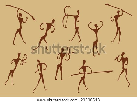
1.  This idea would be painted inside of a tunnel (Sort of like those early cavemen paintings) It shows the transition of a man crawling on all fours to a man walking up right. Although the only thing that changes is his hair. 

Examples of caveman drawings:

Advantages: 
  • Makes a regular old tunnel interesting to look at
  • May attract a lot of attention for this level of creative advertising
Disadvantages:
  • It may be hard to get permission to paint in the tunnel
  • If it attracts a lot of people it may cause unwanted traffic 
  • It may be costly for nivia to paint at such a location.
 2. Coming back to Foong Yann's moss idea. We could have a face painted on a brick wall then some moss grown to 50/50 his face. One half being cleanly shaven with nice hair and the other side portraying messy unruly hair.


Advantages:
  • Low cost
  • Nice to look at 
  • A little hard to do
Disadvantages:
  •  People may try to vandalize it ( gangsters >.> )
  • Vulnerable to the changing weather conditions.
-Komal Puri

Tuesday, 20 November 2012

Advantages and Disadvantages of Billboard Advertisements.

A billboard is a large size structure which is used as the instrument in the outdoor advertising activity and it is mostly found in high traffic areas


Unknown. (2012) Ponds [billboard ad] Available at <http://www.bestdesigntuts.com/billboard-advertising-a-creative-way-to-advertise-your-business/> [Accessed 20th November 2012] 


Unknown. (2012) Formula Toothcare Billboard [billboard ad] Available at <http://www.toxel.com/inspiration/2009/01/05/clever-and-creative-billboard-advertising/>  [Accessed 20th November 2012]


Unknown. (2012) Miele Vacuum Cleaner Billboard [billboad ad] Available at <http://www.toxel.com/inspiration/2009/01/05/clever-and-creative-billboard-advertising/> [Accessed 20th November 2012]


One of the effective tools of advertising is definitely billboard ads. In fact, billboards are the second most effective form of advertising that has reached 93% Americans. It has the ability to market a product or a company to the consumers within 5 seconds as people easily register to photographic memory and slogans. 

Urvashi Pokharna, 2012. Advantages and Disadvantages of Billboard Advertising. [online] Available at <http://www.buzzle.com/articles/advantages-and-disadvantages-of-billboard-advertising.html> Accessed 20th November 2012. 

Advantages of Billboard Ad. 

It is huge and eye-catchy. Billboards are generally placed along the highways and busy streets, which means that it is guarenteed that people will notice it. Unlike tv commercials and print magazine, there is no chance for the consumers to switch the channel or flip the page, so they are forced to see it whether they like it or not. Many people tend to travel in the same route repeatedly, so there's a huge chance that the image of the ad will stick in their minds, as they are frequently exposed to it. And because the average time for someone to notice a billboard is only mere seconds, the concept of the billboard is likely  to be kept short and simple. So, information are delivered effectively.

Disadvantages of Billboard Ad.

There are chances that the ad could be ruined by uncontrollable factors, such as weather. Overexposure to rain and sun could damage the billboard. And there are no ways for the company to ascertain whether the billboard is a success or not, because there are no means of measuring whether the customers are drawn by the advertisement or other means. And usually, there are no feedbacks from the consumers.

Monday, 19 November 2012

Environmental Street Art


Going Green with Street Art

Face of the City (2012) Dan Bergeron. Available at: <http://fauxreel.ca/> [Accessed 30th October 2012]
Inspired by the Dan Bergeron's Face of the City, I thought of a more friendlier way of advertising;"Mother Nature" style.

Instead of relying heavily on paint, we could resort to another alternative, which involves greenery being one of the mediums in creating creative street art advertisement. One example would be using artificial moss and grow it into the desired form of the advertisement.


"Re-civilize Yourself", "Mother Nature" Style.
Since the society of today has become much aware of the green economy, what better way than to promote awareness and support it by advertising through what the brands' products has to offer? Furthermore, this can also lead to an even higher chance in increasing their product's value as the community would most likely be perceived to the idea of it containing natural ingredients.


Inspirations

In This Spore (2012) Anna Garforth. Available at: <http://www.environmentalgraffiti.com/featured/moss-grass-graffiti/2147?image=1> [Accessed 19th November 2012]
British Environmental Street Artist, Anna Garforth explored art further by experimenting with artificial moss after she had found a recipe on how to grow them. From afar, it looks like any other form of street art graffiti, though I can assure you that it is very much "alive". 

Decorating the ceiling of the Designers and Agents Green Room in Los Angeles (2012) Edina Tokodi. Available at: < http://www.environmentalgraffiti.com/featured/moss-grass-graffiti/2147?image=4> [Accessed 19th November 2012]
A moss grandfather clock grows from a concrete column (2012). Edina Tokodi. Available at: < http://www.environmentalgraffiti.com/featured/moss-grass-graffiti/2147?image=5> [Accessed 19th November 2012]
Hungarian Moss Graffiti Artist Edina Tokodi is renowned for her moss art of rabbits and animals in New York's streets. She encourages people to interact with her works of art, to experience the feeling of nature through their senses and learning how to appreciate the beauty of  "life".


A moss tree is home to Inke Heiland’s wallpaper birds. (2012). Inke Heiland. Available at:< http://www.environmentalgraffiti.com/featured/moss-grass-graffiti/2147?image=6> [Accesse 19th November 2012]
Green Drinks (2012) Unknown. Available at: < http://www.environmentalgraffiti.com/featured/moss-grass-graffiti/2147?image=10> [Accessed 19th November 2012]
It seems that I'm not the only one who think of "Going Green" through creative use of street art advertisement. The picture above is actually and advertising campaign called "Green Drinks", which was held in Auckland, New Zealand.

Spraycan Moss Graffiti (2012) Helen Nodding (a.k.a. Ladybird). Available at: < http://www.environmentalgraffiti.com/featured/moss-grass-graffiti/2147?image=12> [Accessed 19th November 2012]
Helen Nodding's (a.k.a. Ladybird) very creative way of describing moss graffiti. Moss is used to replace the paint, thus creating an imagery of it being sprayed onto the wall. Eye-catching, yet very meaningful to the person who understands the meaning which lies behind it.

Moss Bull (2012) The Real Janelle. Available at: < http://www.environmentalgraffiti.com/featured/moss-grass-graffiti/2147?image=16> [Accessed 19th November 2012]
Source: Linda (2012) 20 Masterpieces of Green Graffiti. [online] Available at: < http://www.environmentalgraffiti.com/featured/moss-grass-graffiti/2147?image=0> [Accessed 19th November 2012)
______________________________________________________________________

[The description below is an extra, which actually explains how to grow your own graffitti moss. This is useful in terms of knowing how to estimate the amount of money spent into getting the right amount of ingredients and materials needed.]


How to Grow Your Own Graffiti Moss

You will need a blender to make the mixture and if you plan to grow your moss outdoors you will also need a seed tray filled with compost.

Several clumps of moss
1 pot of natural yoghurt or 12oz buttermilk (experiment to see which works best)
1/2 teaspoon of sugar
Plastic pot (with a lid)
Paint brush
Spray-mister

Seemingly, getting the recipe to work can be quite difficult, the location and weather conditions need to be spot on. Moss thrives best in damp areas so if you have to grow it indoors make sure you spray it with water frequently. As soon as it starts to grow, transplant it in your chosen location and watch your graffiti art spread.

Source: Linda (2012) 20 Masterpieces of Green Graffiti. [online] Available at: < http://www.environmentalgraffiti.com/featured/moss-grass-graffiti/2147?image=0> [Accessed 19th November 2012)

-FY-

Thursday, 8 November 2012

Nivea apologises for ‘inappropriate and offensive’ ad

 extracted from Business ETC, ( http://businessetc.thejournal.ie/nivea-apologises-for-inappropriate-and-offensive-ad-205405-Aug2011/) :

The offending advertisement with the tagline: Look like you give a damn, Re-civilise yourself


 The offending advertisement with the tagline: Look like you give a damn, Re-civilise yourself NIVEA HAS APOLOGISED for its most recent advertisement campaign, which the company itself deemed “inappropriate and offensive”.

 The print ad for its ‘For Men’ range features a clean-shaven, African-American man throwing away a mask of a black man with an Afro and beard (presumably his earlier “non-caring self”) and carries the tag-line, “Look like you give a damn…Re-Civilise Yourself”. The ad created uproar on Twitter and other social media sites after it was printed in Esquire magazine’s September issue. Some Twitter users called for a boycott of the company’s products.

 Others posted photos of themselves sporting Afro hairstyles to the Nivea US Facebook page. One commenter started the trend with the post: I Am Civilized…. I admonish every African American to upload pictures of their natural “civilized selves” with the caption “I Am Civilized. Nivea last night responded to the criticism, stating it would no longer run the ads. In a statement on Facebook, the company said: Thank you for caring enough to give us your feedback about the recent “Re-civilized” Nivea For Men ad. This ad was inappropriate and offensive. It was never our intention to offend anyone, and for this we are deeply sorry. This ad will never be used again. Diversity and equal opportunity are crucial values of our company. -Amirah

Wednesday, 7 November 2012

Side research

Just some side research to let us understand the topic better and how they relate:

1. Racism

Racism is a belief that the various human races are not equal (Often involved thinking ones own race is superior). It is basically racial prejudice or discrimination.

JeanFan (2010) Racism [online] Available at: < Deviantart >


RACE refers to a person's physical appearance, such as skin color, eye color, hair color, bone/jaw structure etc.


 Sources:

2. Ethnicity 

It is where members of a particular race are identified through common traits, background, allegiance, or association.
Sikali (2008) X [online] Available at: < Deviantart >


ETHNICITY refers to cultural factors such as nationality, culture, ancestry, language and beliefs.


Sources:

3. Nationality 

Nationality is citizenship. The country from which you reign from and which you are a member of.

Hashterix (2011) Nationality [online] Available at: < Deviantart >


Sources:
2. un.org
4. Civilization

The evolution of mankind. The material side of mankind that is, the advancement of technology, science and way of thinking. A 'civilized' person is a modern person that is polite and well mannered. on the other hand an uncivilized person is basically referring to barbarians, savages and cavemen.


Vishalgoyal (2006) Fight for Technology [online] Available at: < Deviantart >


Sources:
2. Google Dictionary

-Komal Puri

Street Art Disadvantages + Conclusion

Despite the idea of having street art as part of promoting Nivea's advertisement, "Re-Civilize Yourself", there are disadvantages that might occur during the process/execution of it based on some of the points that I have listed below:
  1. Vandalism
    Art or Vandalism (2008) VPM Marketing and Media, Inc. Available at: <http://adland.tv/ooh/cfrb-1010-gets-people-talking-panhandlers-fly-posters-bike-posters-art-or-vandalism-guerrilla-ca> [Accessed 7th November 2012]
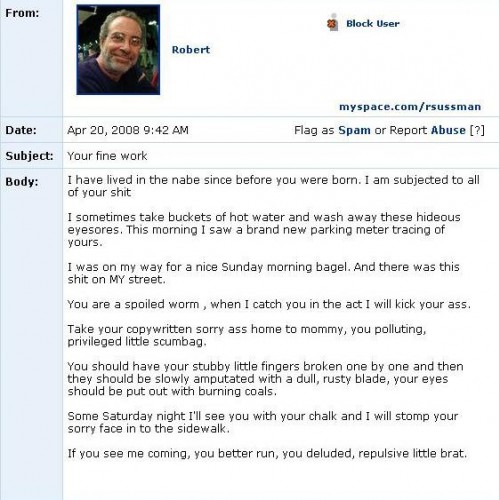
    Believe it or not (Though it isn't surprising to say at the least), there are a certain group/majority of people who disapprove with the idea of street art because it does not appeal to them in any way. While I did some of the research, I had stumbled upon a blog entry which is 'Just How Angry are Street Art Haters?' by Hrag Vartanian [Hrag Vartanian (2010) Just How Angry are Street Art Haters? [online] 13th January 2010. Available at: <http://hragvartanian.com/2010/01/13/angry-street-art-hater/> Accessed [7th November 2012]  :
    Graffiti Hater (2009) Ellis G. Available at: <http://hragvartanian.com/2010/01/13/angry-street-art-hater/> [Accessed 7th November 2012]
    Instead, they would think that it is a form of vandalising government/private property, and take immediate action on removing the "eyesore" as well as the "perpetrator". The "perpetrator", in this case, would feel displeasure; not appreciating the fact that their "works of art" had been removed, and put to blame for committing vandalism.
    Sweeping it Under the Carpet (2006) Banksy. Available at: < http://www.thebhunter.com/2012/04/coolest-banksy-graffiti.html> [Accessed 7th November 2012]
    With permission, street art can be considered as public art which is acceptable towards society. However, there are some street artists who paint without permission,(eg. Banksy, Shepard Fairey) and managed to invoke interests of people with its clever use of conveying a message, as well as having themselves being glorified as legitimate and socially conscious artists. [Kate Nicholson (2010) What is Street Art? Vandalism, graffiti or public art- Part I [online]. 21st January 2010. Available at:<http://artradarjournal.com/2010/01/21/what-is-street-art-vandalism-graffiti-or-public-art-part-i/> [Accessed 7th November 2012] 

  2. Seeking approval
    Approved Stamp (2011) The Decorating Emporium. Available at: <http://maddanmkvi.blogspot.com/2011/11/paperwork-schmaperwork.html> [Accessed 7th November 2012]
    One has to understand that in order for a he/she to be allowed to do whatever they want, they would first have to seek for approval by going through a series of agreements with terms of use. Thus, if we try to re-advertise Nivea's product with 3D street art, we would have to ask consent from the authorities concerned to give permit for promoting the advertisement using this method.
  3. Time and Money
    Time and Money (2011) Fiduciary Plan Governance. Available at: <http://www.fiduciaryplangovernance.com/complying-with-and-leveraging-the-new-401k-fee-disclosure-regulations-2/time-v-money/> [Accessed 7th November 2012]
    Indeed, both time and money are one of the issues that become a part of that disadvantage. As I had mentioned before, undergoing the process itself to gain approval from the government is already time consuming itself, and the probability for the project to be completed might take weeks-no, months; which would take longer in comparison to a normal billboard poster.

    On the other hand, using street art for advertising would also require a large sum of money as well, considering the amount of street artists/workers that one has to hire, as well in covering the cost of the equipments that they would need (eg. stencils, pencil, painting materials) for them to finish the final product.

Conclusion:

Although there are risks where there would be a likelihood that the idea may be rejected and would require various methods of convincing, or undergoing a long process (which might probably take weeks) before it can be approved, it is not impossible if one has the determination of managing its success.

If the idea of using street art was planned perfectly with the improvisation of ideas and solutions for solving the issues that would occur, then it wouldn't pose much of a big problem if the product was advertised as such with prior approval since it is mainly for commercial purposes.

All in all, I find it very useful for one to research about disadvantages of certain things around us in order to avoid those mistakes and prevent them from happening. Even though street art might have it's disadvantages at one point, this does not mean that a person is being unrealistic. With proper amount of thought and consideration, it might turn out to be a promising success one day.

-FY-